W Hotel
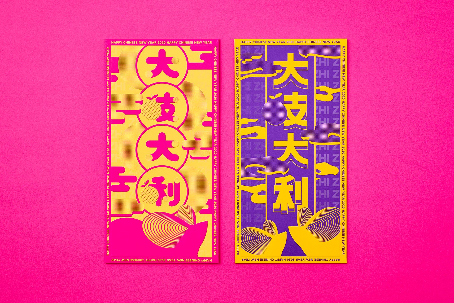
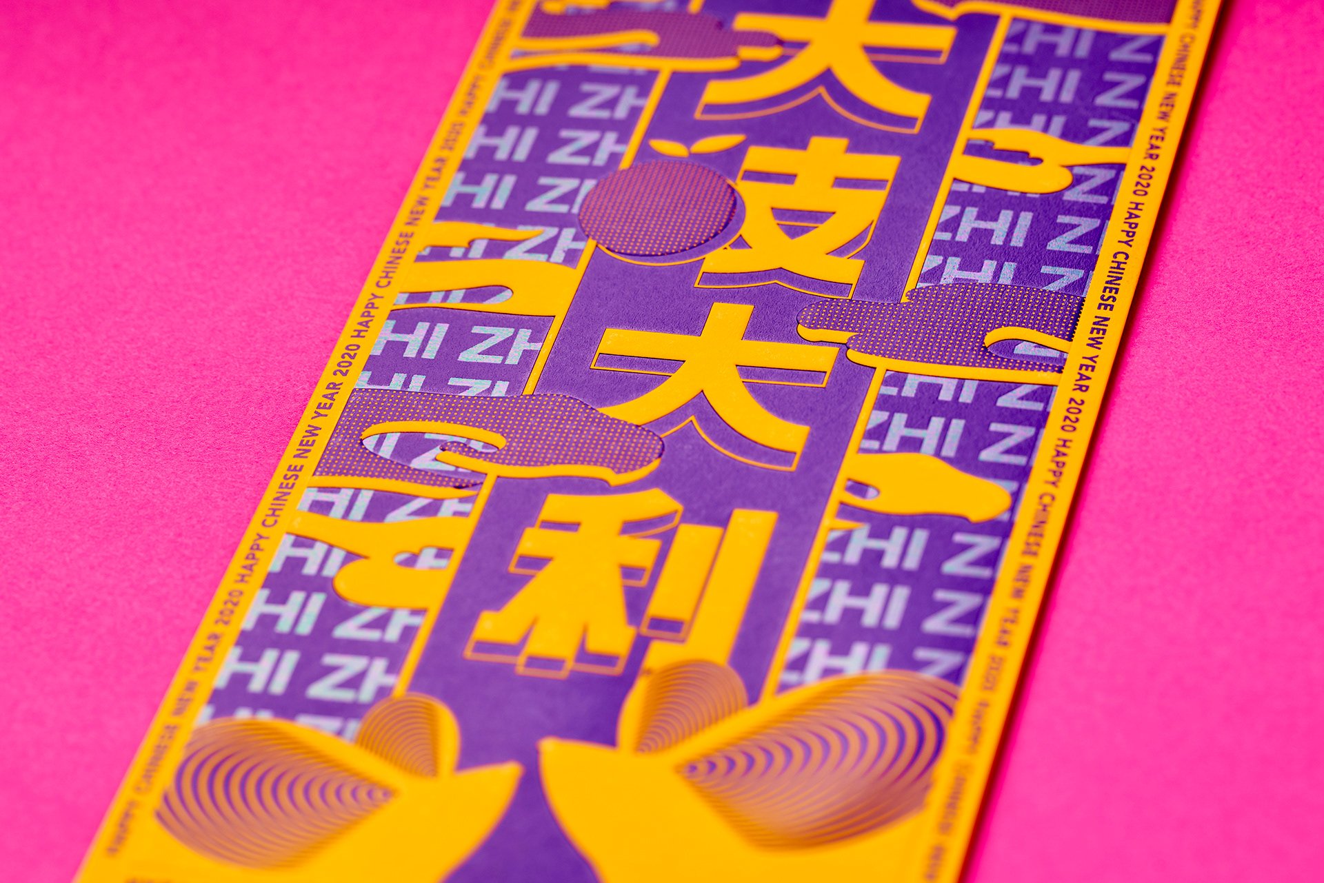
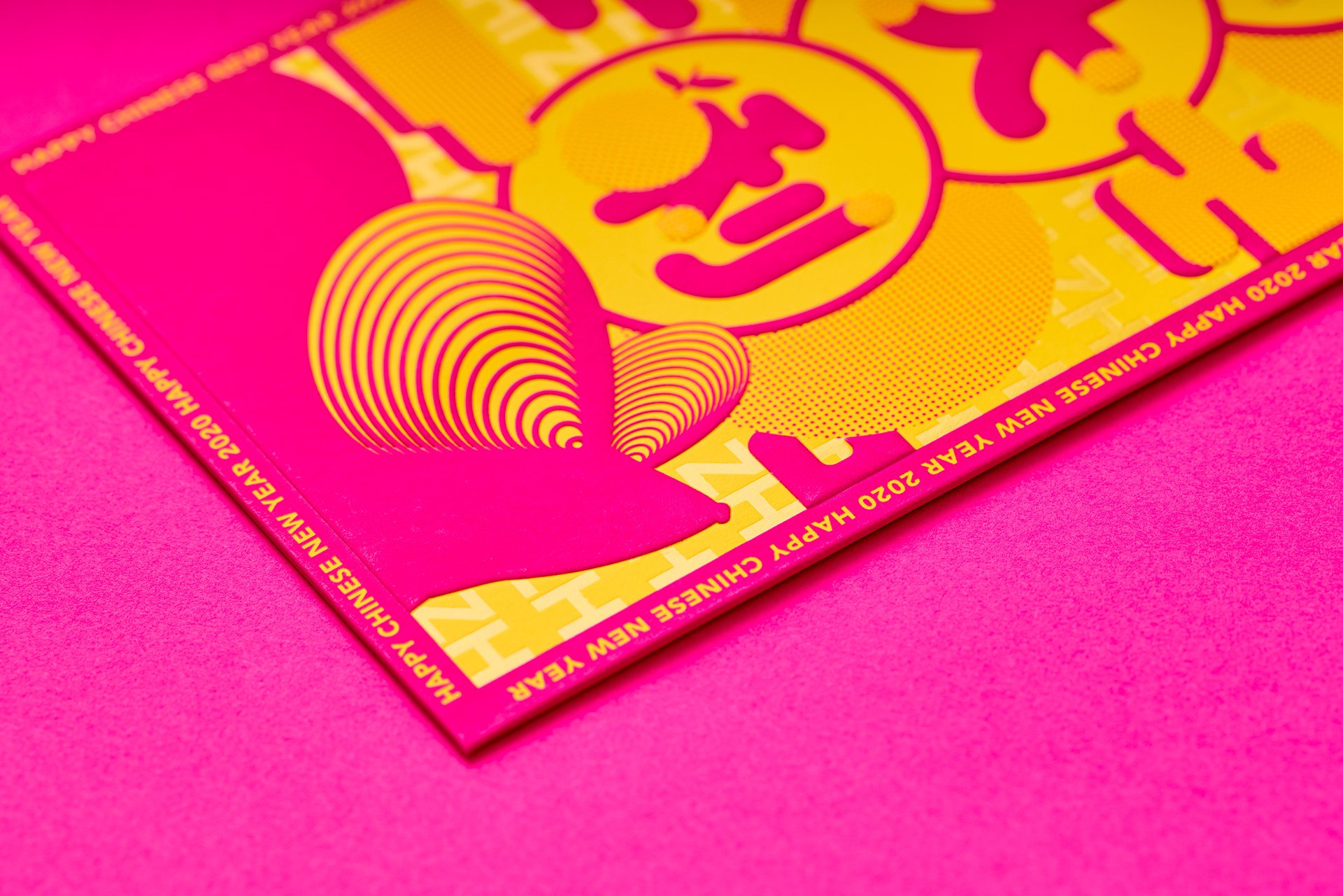
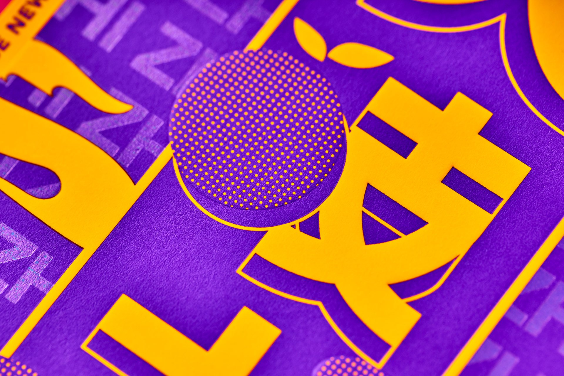
Red packet
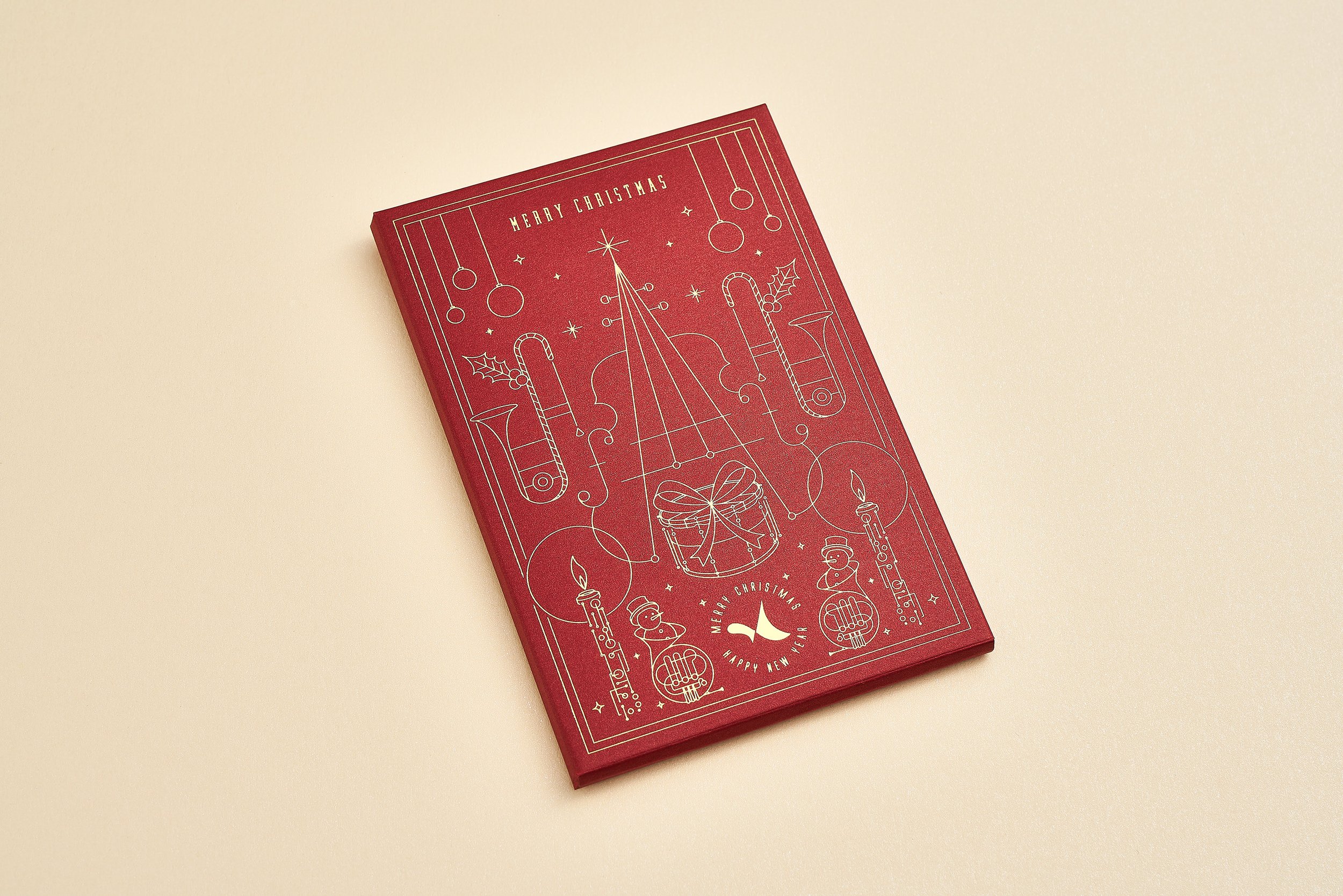
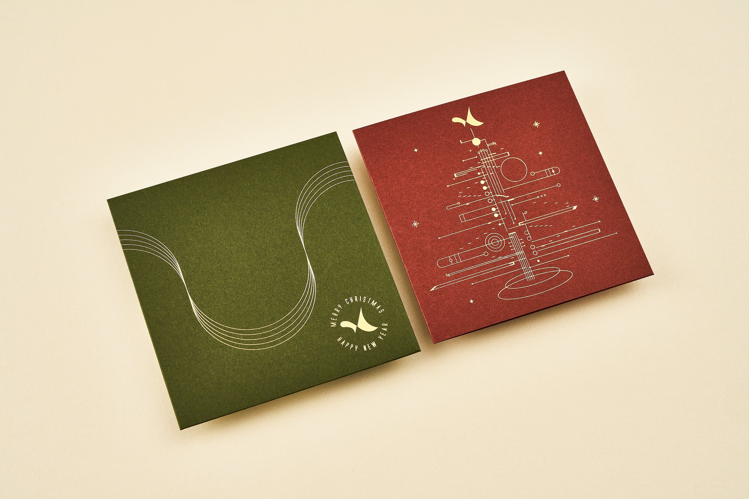
Commissioned by W Hotel Hong Kong, we designed a pair of distinctive red envelopes, ingeniously incorporating the iconic "W" letter into the envelope’s flap, seamlessly embedding W Hotel’s brand DNA. Breaking from tradition, the design features bold color schemes and modern typography, reflecting the brand’s avant-garde and stylish identity while preserving a festive spirit. This creative design not only enhances brand recognition but also captivates guests and collectors, making it a memorable festive keepsake.
What We Handle:
Graphic / Typographic / Print Concepts


Let’s Work Together
We’re always looking for new opportunities and are comfortable working internationally.
Please get in touch and one of our project managers will contact you about beginning the proposal process.
