THE
GATES
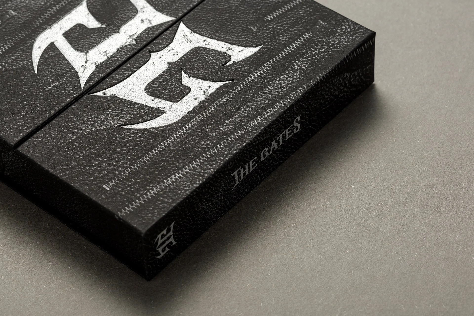
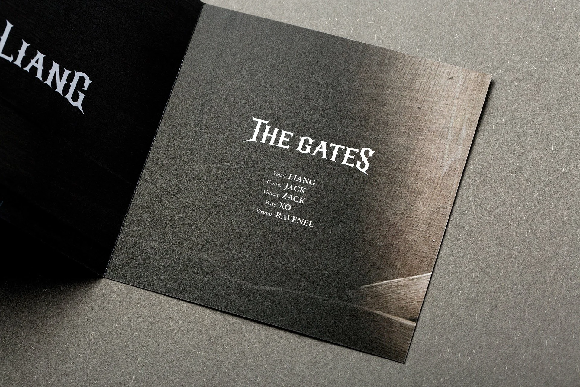
Designed the packaging for the self-titled album of Taiwanese band The Gates, echoing the band’s name with a unique structural design that mimics a pair of opening doors, symbolizing an entry into the world of music. The overall aesthetic, grounded in black and silver tones, creates a bold rock atmosphere, highlighting the band’s rebellious and powerful vibe. The typography ingeniously incorporates the form of doors, reinforcing the band’s name and visual theme. Through refined printing techniques and striking aesthetics, the packaging not only embodies the spirit of rock but also captivates fans as a collectible, enhancing the album’s artistic value and market distinctiveness.
What We Handle:
Logo / Graphic / Typographic / Structure / Paper Selection / Printing Concept / Production


Let’s Work Together
We’re always looking for new opportunities and are comfortable working internationally.
Please get in touch and one of our project managers will contact you about beginning the proposal process.